#Bootstrap 4.3.1
Explore tagged Tumblr posts
Visit Tumblr Blog
Explore Tumblr blogs with no restrictions, modern design and the best experience.
Last Seen Tumblr Blogs


Fun Fact
If you dial 1-866-584-6757, you can leave an audio post for your followers.
Text
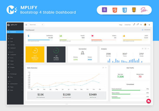
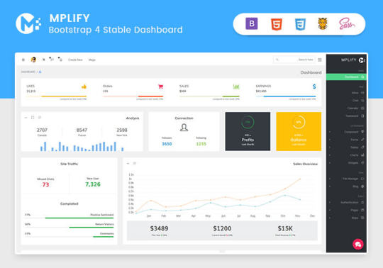
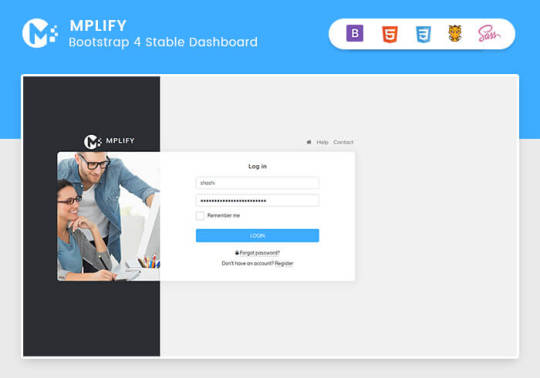
Mplify - Versatile Bootstrap 4 Admin Template by Thememakker
Mplify Admin makes the development process easy and fast for you and aims to help you implement your idea in real time.
Product Highlights
Mplify is a fully professional, responsive, modern, multi-purpose, and feature-rich admin template. It can be used to create various websites, admin templates, admin dashboards, backend websites, CMS, CRM, blogs, business websites, timelines, and portfolios. This versatility makes it an ideal choice for developers looking to build functional and aesthetically pleasing web applications efficiently.
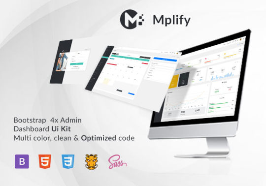
Key Features
Bootstrap 4.3.1: Ensures compatibility and modern design standards.
jQuery 3.3.1: Offers extensive plugins and support.
Built-in SCSS: Provides more flexibility and control over styles.
Light & Dark Full Support: Allows users to switch between light and dark themes.
RTL Full Support: Right-to-left language support for global accessibility.
W3C Validate Code: Ensures high coding standards and practices.
Mobile and Tablet Friendly: Responsive design for all devices.
Treeview: For hierarchical data display.
Drag & Drop Upload: Simplifies file uploading processes.
Image Cropping: Integrated tools for editing images.
Summernote: Rich text editor integration.
Markdown: Support for markdown formatting.
Beautiful Inbox Interface: User-friendly email management.
User-Friendly Chat App: Built-in chat application.
Scrum & Kanban Taskboard: Task management tools.
Add Events to Your Calendar: Event management capabilities.
File Manager: Efficient file organization and management.
Blogging: Tools to manage and create blog posts.
Testimonials: Features to showcase user testimonials.
Maintenance: Tools to manage and schedule maintenance.
Team Board: Collaboration tools for team management.
Search Result: Enhanced search functionalities.
Beautiful Pricing: Elegant pricing tables and plans.
Contact List & Grid: Efficient contact management.
User Profile: Customizable user profiles.
Extended Forms: Advanced form functionalities.
Clean Widgets: A variety of clean, modern widgets.
Technical Specifications
Bootstrap 4.3.1
Bootstrap 4.3.1 is a powerful front-end framework for faster and easier web development. It includes HTML and CSS-based design templates for typography, forms, buttons, tables, navigation, modals, image carousels, and many other interface components, as well as optional JavaScript plugins. Mplify leverages Bootstrap 4.3.1 to ensure a consistent and responsive design across all devices.
jQuery 3.3.1
jQuery is a fast, small, and feature-rich JavaScript library. It makes things like HTML document traversal and manipulation, event handling, and animation much simpler with an easy-to-use custom API integration that works across a multitude of browsers. Mplify includes jQuery 3.3.1 to provide enhanced functionality and interactivity to your applications.
Built-in SCSS
SCSS is a preprocessor scripting language that is interpreted or compiled into CSS. It allows you to use variables, nested rules, mixins, inline imports, and more, all with a fully CSS-compatible syntax. With SCSS, Mplify offers a more powerful and flexible way to manage styles.
Light & Dark Full Support
Mplify comes with built-in support for light and dark themes, allowing users to switch between these modes based on their preferences. This feature enhances user experience and accessibility, especially in different lighting conditions.
RTL Full Support
For developers targeting global audiences, Mplify provides full right-to-left (RTL) language support. This feature ensures that languages like Arabic, Hebrew, and Persian are properly displayed, making the template versatile and inclusive.
W3C Validate Code
The World Wide Web Consortium (W3C) sets the standards for web development. Mplify adheres to W3C's coding standards, ensuring that the template is built with clean, valid code, which improves browser compatibility, SEO, and overall performance.
Mobile and Tablet Friendly
In today's mobile-first world, having a responsive design is crucial. Mplify is designed to be fully responsive, ensuring that your mobile application looks great and functions seamlessly on all devices, including desktops, tablets, and smartphones.
Applications
Mplify’s versatile design and feature set make it suitable for a wide range of applications across various industries. Here are some key applications:
Admin Dashboards
Mplify provides a robust framework for building admin dashboards. With its extensive set of UI components, charts, forms, and tables, you can create comprehensive dashboards that provide valuable insights and data visualization.
CMS (Content Management Systems)
With features like blogging, file management, and user profile management, Mplify can be used to build powerful CMS platforms. Its clean widgets and beautiful interface ensure that the content management experience is both efficient and enjoyable.
CRM (Customer Relationship Management)
Mplify’s built-in tools for managing contacts, scheduling events, and maintaining communication through a chat app make it an excellent choice for developing CRM systems. These features help businesses manage customer interactions and data effectively.
Business Websites
The multi-purpose nature of Mplify allows it to be used for various business websites. Whether you need a portfolio, a blog, or a corporate website, Mplify provides the necessary tools and components to create a professional online presence.
Blogging Platforms
With integrated tools like Summernote for rich text editing and Markdown support, Mplify is ideal for creating blogging platforms. The beautiful inbox interface and testimonial features enhance the blogging experience, making it easy to manage and publish content.
Benefits
Easy and Fast Development
Mplify is designed to streamline the development process. With its pre-built components and templates, you can quickly assemble functional and aesthetically pleasing applications. This reduces development time and costs, allowing you to focus on implementing your ideas in real time.
Professional and Modern Design
Mplify offers a clean, modern design that is both professional and user-friendly. The template includes a variety of customizable widgets and components that adhere to the latest design standards, ensuring your application looks polished and up-to-date.
Comprehensive Feature Set
From task management tools like Scrum and Kanban boards to extensive form functionalities, Mplify provides a wide range of features that cater to various needs. This comprehensive feature set makes it a versatile solution for different types of projects.
Responsive and Mobile-Friendly
With Mplify, you can ensure that your application is accessible on all devices. Its responsive design adapts to different screen sizes, providing a seamless user experience on desktops, tablets, and smartphones.
Global Accessibility
Mplify’s RTL support and multi-language capabilities make it suitable for global applications. This feature ensures that your application can cater to users from different regions, enhancing its reach and usability.
Regular Updates and Support
When you purchase a license for Mplify, you receive all future updates for free. This ensures that your application remains up-to-date with the latest features and improvements. Additionally, Mplify provides excellent customer support to assist with any issues or queries.
Challenges and Limitations
Learning Curve
While Mplify is designed to be user-friendly, there may be a learning curve for beginners who are not familiar with Bootstrap or jQuery. However, comprehensive documentation and community support can help mitigate this challenge.
Customization
Although Mplify offers a wide range of customization options, extensive customization may require advanced knowledge of SCSS and JavaScript. This could be a limitation for developers who are not well-versed in these technologies.
Performance
As with any feature-rich template, there is a potential for performance issues if too many components and plugins are used simultaneously. It is important to optimize the application and selectively use features to maintain optimal performance.
Latest Innovations
Enhanced UI Components
Mplify continues to evolve with regular updates that introduce new and improved UI components. These enhancements ensure that your application remains modern and functional.
Advanced-Data Visualization
Recent updates have focused on improving data visualization capabilities. With enhanced charting tools and interactive elements, Mplify allows for more dynamic and engaging data presentation.
Integration with New Technologies
Mplify is continuously updated to integrate with the latest web technologies. This ensures compatibility with new frameworks and libraries, providing developers with more tools to build advanced applications.
Future Prospects
AI and Machine Learning Integration
The future of Mplify may include integration with AI and machine learning tools. This would enable developers to build more intelligent and automated applications, enhancing user experience and functionality.
Expanded Plugin Support
As the web development landscape evolves, Mplify is likely to expand its plugin support. This will provide developers with more options for extending the functionality of their applications.
Improved Accessibility Features
Mplify is expected to continue enhancing its accessibility features. This includes better support for assistive technologies and compliance with accessibility standards, ensuring that applications built with Mplify are inclusive for all users.
Comparative Analysis
Versus Other Bootstrap Templates
When compared to other Bootstrap templates, Mplify stands out due to its comprehensive feature set, modern design, and extensive customization options. While other templates may offer similar components, Mplify's unique features like RTL support and advanced task management tools give it an edge.
Versus Custom Development
Opting for a pre-built template like Mplify can significantly reduce development time and costs compared to custom web development. While custom development offers more flexibility, Mplify provides a robust foundation that can be easily customized to meet specific needs.
User Guides and Tutorials
Getting Started with Mplify
Installation: Download and install Mplify from the official website or marketplace.
Configuration: Configure the template settings according to your project requirements.
Customization: Use the built-in SCSS files to customize the styles and appearance.
Integration: Integrate Mplify with your backend systems and databases.
Deployment: Deploy your application on your preferred hosting platform.
Advanced Customization Techniques
SCSS Variables: Use SCSS variables to easily change colors, fonts, and other styles.
JavaScript Customization: Extend the functionality by adding custom JavaScript code.
Component Modification: Modify existing components or create new ones to meet specific needs.
Performance Optimization: Optimize the performance by minifying CSS and JavaScript files, and selectively loading components.
Conclusion
Mplify is a powerful, versatile, and user-friendly Bootstrap 4 admin dashboard template. It offers a wide range of features and customization options, making it suitable for various applications, from admin dashboards to business websites. With its modern design, responsive layout, and extensive documentation, Mplify simplifies the development process, allowing developers to implement their ideas in real time efficiently.
Whether you are building a CMS, CRM, or a personal blog, Mplify provides the tools and flexibility needed to create a professional and functional web application. Its ongoing updates and support ensure that your projects remain current and compatible with the latest web technologies.
#Mplify Admin#Bootstrap 4.3.1#jQuery 3.3.1#SCSS#Light & Dark Theme#RTL Support#W3C Validation#Responsive Design#Admin Template#Admin Dashboard#CMS#CRM#Blogging#Business Websites#Web Development#UI Components#Data Visualization#AI Integration#Machine Learning#Accessibility Features#Task Management#File Management#Rich Text Editor#Markdown Support#User Profiles#Performance Optimization#Web Technologies#Custom Development#Web Application Development#Front-end Framework
0 notes
Link
Last Update 16 January 19 Created 19 April 13 Gutenberg Optimized No Widget Ready Yes Compatible Browsers IE8, IE9, IE10, Firefox, Safari, Opera, Chrome Compatible With WPML, Bootstrap 2.3.x, Bootstrap 2.2.2 Software Version WordPress 5.0.x, WordPress 4.9.x, WordPress 4.8.x, WordPress 4.7.x, WordPress 4.6.1, WordPress 4.6, WordPress 4.5.x, WordPress 4.5.2, WordPress 4.5.1, WordPress 4.5, WordPress 4.4.2, WordPress 4.4.1, WordPress 4.4, WordPress 4.3.1, WordPress 4.3, WordPress 4.2, WordPress 4.1, WordPress 4.0, WordPress 3.9, WordPress 3.8, WordPress 3.7, WordPress 3.6, WordPress 3.5, WordPress 3.4 ThemeForest Files Included Layered PSD, PHP Files, CSS Files, JS Files Columns 4+ Documentation Well Documented Layout Responsive Tags bootstrap, business, clean, corporate, creative, oxygenna, professional, responsive, retina, timeline, typography, unique, wordpress
0 notes
Text
Login Page Using Bootstrap 4

Tags Bootstrap 4 login form. × Note: See the tutorial on Bootstrap Forms to learn how to customize this layout further. Bootstrap 3 version of this snippet is available here. Similar Snippets. Simple Login Form. Simple Login Form. Simple Login Form. View All Snippets.
Bootstrap Html Examples

Bootstrap Login Form with Floating Labels. Login Form with Floating Form Labels and Social Logins. Bootstrap 4.3.1. Need more UI elements? Try SB UI Kit Pro, which is packed with custom view, pages, and components to help you get started on your next project! Want more Bootstrap. Bootstrap 4 Login Page Template. My Login is a Bootstrap 4 Login Page Snippet, you can use it as you wish and it's free for personal or commercial use. Let's make it easy! Just download this template, use it on your project. Login; Register; Forgot Password; Reset Password; Features. Bootstrap 4.1.3; Bootstrap 4 Validation. Bootstrap 4's Default Settings. Form controls automatically receive some global styling with Bootstrap: All textual, and elements with class.form-control have a width of 100%.
Published: 8.5.2019 | Last update: 13.5.2019
Create a login split page using Bootstrap 4.
If you liked this snippet, you might also enjoy exploring Bootstrap Sticky Footer or About us page .
Please note that the interactive editor on this page should be viewed on your laptop or desktop for the best results.
How to use the snippet


There are two ways to use the snippet:
Bootstrap Html Examples
a] Copy it into your project. This means:
Copy content of the HTML, CSS, JavaScript tabs into your project
Make sure that you have jQuery 3 and Bootstrap 4's CSS and JS included in your project too.
That should be it, and you should be good to go.
b] Use the 'Edit in JSFiddle' link in the top right and play with it in the JSFiddle. After adjusting what you need, you can use the same steps as in a] to develop it locally.
0 notes
Photo
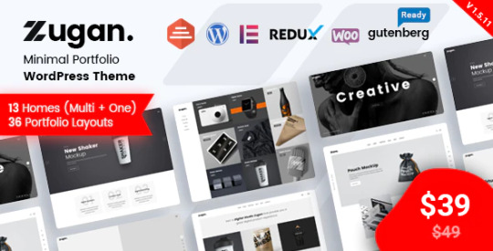
Download Zugan - Minimal Portfolio WordPress Theme on themeforest
Description Zugan - Minimal Portfolio WordPress Theme :
Download Zugan - Minimal Portfolio WordPress Theme. The Theme releases on Thursday 7th February 2019 By The Author RadiusTheme on Themeforest. It’s uses for agency,blog,bootstrap 4,business,clean,creative,creative design,creative portfolio,freelancer,minimal,portfolio,portfolio theme,web designer. Theme Title: Zugan - Minimal Portfolio WordPress Theme Category: wordpress/creative/portfolio Price: $39 Author: RadiusTheme Published Date: Thursday 7th February 2019 09:41:38 PM More Info / DownloadDemo

Zugan – Minimal Portfolio WordPress Theme
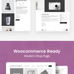
Zugan is a minimal WordPress portfolio theme with a lot of great features. Its versatile structure means that you can use Zugan as a designer, photographer, freelancer, artist, agency, and even as someone who is looking to sell their work with WooCommerce.
Extensive layout options
By doing thorough market research, we have tailored the Zugan theme specifically for the needs of modern portfolio websites. Out of the box, you’ll get access to more than 13 unique homepage layouts. What’s more, you’ll be able to use more than 36 original portfolio pages. Each custom page design will help to propel the website design towards your vision.
Customize with Elementor
If you don’t enjoy spending endless hours on customizing, we got your back. Zugan is powered by the Elementor Page Builder, which provides immense flexibility for rapid customization. Every section and page element that you see in Zugan’s demo layouts, you’ll be able to customize with a few clicks by using Elementor’s powerful customization engine.
Built with SEO in mind
Do you want to include long-form descriptions for your portfolio pages? Are you looking for a portfolio theme which lets you write blog posts? Whatever your preference, we’ve ensured that Zugan remains SEO-friendly throughout the entire theme. Publish your portfolio items and stories, and reap the rewards of organic search traffic.
High-standard compatibility
We hold ourselves to a high standard. And to reflect that in this minimal portfolio theme, we’re adding compatibility with the leading WordPress plugins. Enjoy using Yoast SEO, WPML, AMP, Disqus, MailChimp, and many other plugins, all without needing to worry about technical stuff.
Our team of WordPress experts is always at your disposal. Whether you need help with setting things up, or you’re looking for advice on customization—we’re here to help.


Zugan Features:
Based on Bootstrap 4
13 Home pages
36 Total Portfolio Pages (Grid, Isotope, Masonry & Slider)
02 About Pages
03 Blog Pages
05 Headers & 03 Top bars
05 Footer Variations
Drag & Drop Page Builder included – Elementor
Powerful Premium Slider included – Revolution Slider ($26)
Responsive & Mobile Friendly.
SEO Friendly
Unlimited Color Combinations.
Customizer Included so you can change real time of theme option
Powerful Admin Panel by Redux.
Dynamic Page Header
Clean, Trending and Modern Design.
Free Lifetime updates!
One Click Demo Importer.
Child Theme Included.
Supports all modern browsers Chrome, Safari, Firefox, IE11+.
WPML Translation Supported ( also pot file included)
Quick & Faster Support (15 hrs online in a day)
Google Web Font
Detail Documentation Included.
ICONS:
Font & Fontawesome Icon
IMAGES:
http://allfreephotos.net/
FONTS:
Roboto (www.google.com/fonts/specimen/Roboto) Poppins (www.google.com/fonts/specimen/Poppins)
Change Logs
Version 1.5.13 (Jan 05, 2021)
Fixed: Mobile Menu fixed for WordPress 5.6 Fixed: Isotope addon data after demo install Plugin Update: Zugan Core 1.5.10 , RevSlider 6.3.5 , Rt demo Import 4.3.1,
Version 1.5.11 (July 23, 2020)
Fixed: Breadcrumb system Plugin Update: RevSlider 6.2.17
Version 1.5.10 (May 30, 2020)
Fixed: Vertical menu js Plugin Update: Revoulation Slider
Version 1.5.8 (Mar 24, 2020)
Fix: Portfolio Categories Plugin Update: Zugan Core 1.5.9, Revolution Slider 6.2.2
Version 1.5.8 (Mar 05, 2020)
Fixed: Menu text color change option for transparent header Fix: Portfolio all layout warning Plugin update: Zugan core 1.5.8
Version 1.5.7 (Nov 08, 2019)
Update: Next/Previous button link fixed Update: Footer Widget title bug fixed Plugin Update: Zugan core 1.5.7
Version 1.5.4 (April 23, 2019)
Updated: Portfolio Tag Added: Portfolio Tag Page Added: Youtube Icon in Social Widget Fixed: Minor CSS Plugin update: Zugan core 1.5.4
Version 1.5.3 (April 04, 2019)
Fixed: Elementor editor for single portfolio Added: Caption added in single portfolio page image Plugin update: Zugan core 1.5.2
Version 1.5.1 (March 27, 2019)
Fixed: Isotope Filter "all button" Plugin update: Zugan core 1.5.1
Version 1.5 (March 21, 2019)
Fixed: Download PDF option fixed Added: Multiple category select option Fixed: Footer Options Plugin update: Zugan core 1.5, Revolution Slider 5.4.8.3
Version 1.4 (Feb 28, 2019)
Add: 2 new Home Pages. Add 20+ different portfolio layout Grid, Isotope, Masonry & Slider. Update: Zugan core plugin
Version 1.3 (Feb 23, 2019)
Fix: Some Responsive issue
Version 1.2 (Feb 15, 2019)
Fixed: Slider Addon mobile Responsive Fixed: Full page Slider footer position fixed. Fixed: Header 5 and header-2 mobile menu Plugin update: Zugan core 1.2
More Info / DownloadDemo #Zugan #Minimal #Portfolio #WordPress #Theme
#agency#All_Theme_amp_Template#blog#bootstrap_4#business#clean#creative#creative_design#creative_portfolio#freelancer#minimal#New_releases#portfolio#portfolio_theme#Theme_amp_Template_new_release#web_designer#Wordpress_new_release#Wordpress_theme
0 notes
Text
Applyou - App Landing Page HTML Template
Applyou – App Landing Page HTML Template
Laravel 8 Cms Version(NEW) Need a landing page? It has many unique features with its modern and clean design. It allows you to grow your company and business, submit a contact form before the page is refreshed, start you with Applyou and select your demo to bring your company to the top Main Features Based on Bootstrap 4.3.1 Login & Sign Up Popup Dropdown Menu Valid HTML5 & CSS3 Sign Up…

View On WordPress
#app#app ui#bootstrap 4#clean#landing page#Laravel#marketing#mobile app#one page#saas#saas landing#software#technology
0 notes
Text
Torres – React App Landing Page Template
Torres – React App Landing Page Template
Torres – React Multipurpose Landing Page Template is a stunning React template crafted with huge potential. Torres is a very good React Template, which best for any kind of App landing page. Torres is built with the market trend and the well-anticipated future of the landing page. We have crafted this template with React v16.8.6, Bootstrap 4.3.1, HTML 5, CSS3, SCSS and W3C validated markup. All…

View On WordPress
#app landing#app landing template#app react#App Showcase#landing#mobile app landing#mobile react template#modern#react#react app#react js template#react landing template#react one page#reactjs#startup
0 notes
Text
Hướng dẫn thực hiện layout với bootstrap

Contents
Sử dụng grid system và các loại thiết bị
Độ rộng của cột cho các thiết bị sẽ bằng nhau
Độ rộng của các cột bằng nhau từ md đi lên
Độ rộng của các cột bằng nhau từ lg đi lên
Độ rộng bằng nhau và có ngắt dòng
Tuỳ chỉnh độ rộng của các cột
Điều chỉnh độ rộng trên nhiều thiết bị
Dịch chuyển cột
Để có thể thêm layout với bootstrap cho website của bạn thì bạn chỉ cần sử dụng grid system của bootstrap là xong, khi đó grid sẽ giúp bạn làm layout nhanh và dễ dàng nhất. Trong bài viết này, blog getbootstrap sẽ đi sâu hơn vào trong việc thực hiện layout bằng bootstrap. Mời các bạn cùng tham khảo.
Sử dụng grid system và các loại thiết bị
Grid System là gì? thì bạn có thể tham khảo tại bài viết ở trên. Và với bootstrap 4 thì có 5 loại class css cho nhiều thiết bị khác nhau như bảng dưới.
.col- small devices, screen width <=576px .col-sm- small devices, screen width >576px .col-md- medium devices, screen width >=768px .col-lg- large devices, screen width >=992px .col-xl- xlarge devices , screen width >=1200px
Một vài thông số cần biết về contrainer
Extra small <576px Small ≥576px Medium ≥768px Large ≥992px Extra large ≥1200px Max container width None (auto) 540px 720px 960px 1140px Class prefix .col- .col-sm- .col-md- .col-lg- .col-xl- # of columns 12 Gutter width 30px (15px on each side of a column) Nestable Yes Column ordering Yes
Độ rộng của cột cho các thiết bị sẽ bằng nhau
<!doctype html><html> <head> <meta charset=”utf-8″> <meta name=”viewport” content=”width=device-width, initial-scale=1, shrink-to-fit=no”> <link rel=”stylesheet” href= “https://stackpath.bootstrapcdn.com/bootstrap/4.3.1/css/bootstrap.min.css”> <title>Tiêu đề trang web</title> <style> .row div{height: 100px; } </style> </head><body> <div class=”container”> <div class=”row”> <div class=”col bg-danger”> Cột 1 </div> <div class=”col bg-success”> Cột 2</div> </div> <div class=”row”> <div class=”col bg-info”> Cột 1 </div> <div class=”col bg-warning”> Cột 2 </div> <div class=”col bg-info”> Cột 3 </div> </div> </div> </body></html>

Độ rộng thiết bị Grid System
Độ rộng của các cột bằng nhau từ md đi lên
<!doctype html><html> <head> <meta charset=”utf-8″> <meta name=”viewport” content=”width=device-width, initial-scale=1, shrink-to-fit=no”> <link rel=”stylesheet” href=”https://stackpath.bootstrapcdn.com/bootstrap/4.3.1/css/bootstrap.min.css”> <title>Tiêu đề trang web</title> <style> .row div{height: 100px; } </style> </head><body> <div class=”container”> <div class=”row”> <div class=”col-md bg-danger”> Trái </div> <div class=”col-md bg-success”> Phải</div> </div> <div class=”row”> <div class=”col-md bg-info”> Cột 1 </div> <div class=”col-md bg-warning”> Cột 2 </div> <div class=”col-md bg-info”> Cột 3 </div> </div> </div> </body></html>

Độ rộng của các thiết bị từ md trở lên
Độ rộng của các cột bằng nhau từ lg đi lên
<!doctype html><html> <head> <meta charset=”utf-8″> <meta name=”viewport” content=”width=device-width, initial-scale=1, shrink-to-fit=no”> <link rel=”stylesheet” href=”https://stackpath.bootstrapcdn.com/bootstrap/4.3.1/css/bootstrap.min.css”> <title>Tiêu đề trang web</title> <style> .row div{height: 100px; } </style> </head><body> <div class=”container”> <div class=”row”> <div class=”col-md bg-danger”> Trái </div> <div class=”col-md bg-success”> Phải</div> </div> <div class=”row”> <div class=”col-md bg-info”> Cột 1 </div> <div class=”col-md bg-warning”> Cột 2 </div> <div class=”col-md bg-info”> Cột 3 </div> </div> </div> </body></html>
Độ rộng bằng nhau và có ngắt dòng
<!doctype html><html> <head> <meta charset=”utf-8″> <meta name=”viewport” content=”width=device-width, initial-scale=1, shrink-to-fit=no”> <link rel=”stylesheet” href= “https://stackpath.bootstrapcdn.com/bootstrap/4.3.1/css/bootstrap.min.css”> <title>Tiêu đề trang web</title> <style> .row .col{height: 100px; } </style> </head><body> <div class=”container”> <div class=”row”> <div class=”col bg-warning”>col</div> <div class=”col bg-secondary”>col</div> <div class=”col bg-warning”>col</div> <div class=”col bg-secondary”>col</div> <div class=”w-100″></div> <div class=”col bg-success”>col</div> <div class=”col bg-info”>col</div> <div class=”w-100″></div> <div class=”col bg-secondary”>col</div> <div class=”col bg-warning”>col</div> <div class=”col bg-secondary”>col</div> </div> </div> </body></html>

Độ rộng bằng nhau và có ngắt dòng
Tuỳ chỉnh độ rộng của các cột
<!doctype html><html> <head> <meta charset=”utf-8″> <meta name=”viewport” content=”width=device-width, initial-scale=1, shrink-to-fit=no”> <link rel=”stylesheet” href=”https://stackpath.bootstrapcdn.com/bootstrap/4.3.1/css/bootstrap.min.css”> <title>Tiêu đề trang web</title> <style> .row div{height: 100px; } </style> </head><body> <div class=”container”> <div class=”row”> <div class=”col bg-warning”> 1 of 3 </div> <div class=”col-6 bg-info”> 2 of 3 (wider) </div> <div class=”col bg-warning”> 3 of 3 </div> </div> <div class=”row”> <div class=”col bg-primary”> 1 of 3 </div> <div class=”col-5 bg-success”> 2 of 3 (wider) </div> <div class=”col bg-primary”> 3 of 3 </div> </div> </div> </body></html>

Tuỳ chỉnh độ rộng của các cột
Điều chỉnh độ rộng trên nhiều thiết bị
<!doctype html><html> <head> <meta charset=”utf-8″> <meta name=”viewport” content=”width=device-width, initial-scale=1, shrink-to-fit=no”> <link rel=”stylesheet” href=”https://stackpath.bootstrapcdn.com/bootstrap/4.3.1/css/bootstrap.min.css”> <title>Tiêu đề trang web</title> <style> .row div{height: 100px; } </style> </head><body> <div class=”container”> <div class=”row”> <div class=”col-12 col-md-8 bg-warning”>.col-12 .col-md-8</div> <div class=”col-6 col-md-4 bg-primary”>.col-6 .col-md-4</div> </div> <!– Columns start 50% on mobile and 33.3% on desktop –> <div class=”row”> <div class=”col-6 col-md-4 bg-secondary”>.col-6 .col-md-4</div> <div class=”col-6 col-md-4 bg-info”>.col-6 .col-md-4</div> <div class=”col-6 col-md-4 bg-secondary”>.col-6 .col-md-4</div> </div> <!– Columns always 50%, on mobile and desktop –> <div class=”row”> <div class=”col-6 bg-primary”>.col-6</div> <div class=”col-6 bg-warning”>.col-6</div> </div> </div> </body></html>

Điều chỉnh độ rộng trên nhiều thiết bị
Dịch chuyển cột
Với bootstrap 3 thì có class là: col-offset-n, còn đối với bootstrap 4 thì có class là: offset-n, giúp bạn có thể dịch chuyển vào n cột:
offset-md-n: dịch chuyển n cột trên thiết bị md
offset-n: dịch vào n cột
<div class=”container”> <div class=”row”> <div class=”col-4 bg-success”>LEFT</div> <div class=”col-4 offset-4 bg-danger”>RIGHT</div> </div> <div class=”row”> <div class=”col-6 offset-3 bg-info”>MAIN</div> </div> </div>
Dịch chuyển cột trong bootstrap
Hi vọng với những thông tin ở trên về cách thêm và sử dụng layout trong bootstrap sẽ giúp bạn tạo layout cho website dễ dàng hơn. Nếu như các bạn còn thắc mắc về kiến thức của bootstrap thì có thể tham khảo thêm các bài viết trước đây, hãy cùng học bootstrap 4 với blog getbootstrap nhé. Chúc các bạn thành công.
The post Hướng dẫn thực hiện layout với bootstrap appeared first on 7 vien ngoc rong - Game 7 viên ngọc rồng online.
0 notes
Text
Medifab - Hospital, Clinic & Medical Appointment booking Bootstrap 4 Template with Admin Dashboard
Medifab is a Multipurpose and Responsive HTML5 Template best suitable for health clinics, hospitals, medical organizations, dentists, dental hygienists, & more. For Live Demo Visit: https://bit.ly/2BpRAOK
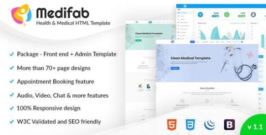
We specially developed for Book Appointment, Showcase Specialist/Doctor’s, Showcase Internal Departments, Showcase your Services, and etc. 9 Ready Templates with full website demos on the way just for you. These are just a few possibilities of the unique designs that you can showcase in a Clinic or Hospital.
Our HTML Template is a very simple, clean and professional way to impress your customers and packed with new Key features.
Core Features
Clinic/Hospital Website Aimed Design
Booking Offline and Online Consultation
Simple and clean Home/Landing page
Showcase Specialist/Doctor’s
Showcase Internal Departments
Showcase your Services
Multi-Layout Blog page
Showcase your Location with Google map
Social Media share options
Built According to Best Practices
High Definition Ready
SEO Friendly Works inside
Compatible to all Mobile Devices
Responsive Design with Bootstrap 4.3.1
Google Map integrated in Contact Form
Google Web Fonts
Font Awesome icons
Cross Browser Compatible
Fully Customizable
Powerful & Lightweight
Additional pages like Login, Registration, forgot password and 404.
#admin dashboard#admin template#appointment booking template#booking template#clinic template#doctor appointment#patient management template
0 notes
Link
Last Update 22 April 19 Created 2 June 18 Gutenberg Optimized No High Resolution Yes Widget Ready Yes Compatible Browsers IE9, IE10, IE11, Firefox, Safari, Opera, Chrome Compatible With Visual Composer 5.1.x, Bootstrap 3.x Software Version WordPress 4.9.x, WordPress 4.8.x, WordPress 4.7.x, WordPress 4.6.1, WordPress 4.6, WordPress 4.5.x, WordPress 4.5.2, WordPress 4.5.1, WordPress 4.5, WordPress 4.4.2, WordPress 4.4.1, WordPress 4.4, WordPress 4.3.1, WordPress 4.3, WordPress 4.2, WordPress 4.1 ThemeForest Files Included PHP Files, CSS Files, JS Files Columns 4+ Documentation Well Documented Layout Responsive Tags advertisement, airbnb, broker, business directory, classified, dashboard, directory, directory and listing, directory listing wordpress, directory wordpress, front end submission, listing, local business, local listing, marketplace
0 notes
Text
#6 免費WordPress主題2020年3月 WordPress主題下載-Revity/Hala/Photography Photty- Themeforest
New Post has been published on https://imayday.co/themeforest-2020-03/
#6 免費WordPress主題2020年3月 WordPress主題下載-Revity/Hala/Photography Photty- Themeforest

Table Of Contents
前言
2020 3月 WordPress免費主題
Revity-OnePage Parallax
Hala – Creative Multi-Purpose WordPress Theme
Photography Photty
下載鏈結:Themeforest
前言
在2月份Themeforest送Kunco/Minera/Unica三套主題後,緊接著在2020年現在3月又送出三套Wordpress主題
分別是Revity/Hala/Unica,以下就直接貼出介紹囉
2020 3月 WordPress免費主題
Revity-OnePage Parallax

REVITY is a simple Responsive WordPress Creative Business Theme, focused on minimalism, elegance and simplicity. You can create Freelancer Portfolio, Onepage Parallax, Basic Studio Website, Minimalist Personal Portfolio, Small Creative Showcase, Portfolio Product Designer Portfolio and more same website projects. The theme is completely customizable with WordPress WPBakery Page Builder , Shortcodes and Visual CSS customizer. Theme pages supported all WordPress shortcodes and html elements so you can add any content freely. The Bootstrap framework will protect you from serious loss of time in all the changes and theme updates. We have also created a simple yet flexible theme infrastructure that you’ll need from design to coding.
Last Update7 March 20Created8 March 17Gutenberg OptimizedNoHigh ResolutionYesWidget ReadyYesCompatible BrowsersIE10, IE11, Firefox, Safari, Opera, Chrome, EdgeCompatible WithEasy Digital Downloads, Gravity Forms, Visual Composer 5.1.x, Visual Composer 4.12.x, WooCommerce 3.9.x, WooCommerce 3.8.x, WooCommerce 3.7.x, WooCommerce 3.6.x, WooCommerce 3.5.x, WooCommerce 3.4.x, WooCommerce 3.3.x, WooCommerce 3.2.x, WooCommerce 3.1.x, WPBakery Page Builder 6.1.x, WPBakery Page Builder 6.0.x, WPBakery Page Builder 5.7.x, WPBakery Page Builder 5.6.x, WPML, Bootstrap 4.x, Bootstrap 3.xSoftware VersionWordPress 5.3.x, WordPress 5.2.x, WordPress 5.1.x, WordPress 5.0.x, WordPress 4.9.x, WordPress 4.8.x, WordPress 4.7.x, WordPress 4.6.1, WordPress 4.6, WordPress 4.5.x, WordPress 4.5.2, WordPress 4.5.1, WordPress 4.5, WordPress 4.4.2, WordPress 4.4.1, WordPress 4.4, WordPress 4.3.1, WordPress 4.3, WordPress 4.2, WordPress 4.1ThemeForest Files IncludedPHP Files, CSS Files, JS FilesColumns3DocumentationWell DocumentedLayoutResponsiveTagsbootstrap, clean, creative, dark, flat, html5, minimal, modern, one page, parallax, personal, portfolio, responsive, resume, video
Hala – Creative Multi-Purpose WordPress Theme

Packed with heaps of functionality, features, layout options and resources, these free WordPress themes can be easily customised and turned into the website you’re thinking of, without compromise. Plus, we always include in this selection free responsive WordPress themes—so you know your site is going to look slick and great, regardless of the screen size. You can play around with multiple design options too: plenty of themes usually feature different header and footer layouts, homepage structures and page templates. Free e-commerce WP themes include powerful admin dashboards, and all themes in general are SEO-friendly.
Last Update1 December 18Created28 February 17Gutenberg OptimizedYesHigh ResolutionYesWidget ReadyYesCompatible BrowsersIE11, Firefox, Safari, Opera, ChromeCompatible WithVisual Composer 5.1.x, Visual Composer 4.12.x, WooCommerce 2.6.x, WooCommerce 2.5, Bootstrap 3.xSoftware VersionWordPress 5.0.x, WordPress 4.9.x, WordPress 4.8.x, WordPress 4.7.x, WordPress 4.5.x, WordPress 4.5.2, WordPress 4.5.1, WordPress 4.5ThemeForest Files IncludedPHP Files, CSS Files, JS FilesColumns4+DocumentationWell DocumentedLayoutResponsiveTagsagency, blog, business, corporate, creative, freelance, marketing, modern, multipurpose, one page, parallax, photography, portfolio, responsive, shop
Photography Photty

Concerned about quality? Don’t be! ThemeForest is one of the world’s leading WordPress themes marketplace. Our themes are developed and maintained by creative professionals from all over the world. Plus, our staff hand-reviews all themes one by one before they go on sale, to make sure they meet our quality and functionality standards. And if you need a little help setting up the theme for your website, no problem! When you download our free WordPress themes, you’ll find that they come with detailed documentation to help you get all set up and make the most out of the theme.
Last Update3 January 20Created23 February 17Gutenberg OptimizedNoHigh ResolutionYesWidget ReadyYesCompatible BrowsersIE9, IE10, IE11, Firefox, Safari, Opera, Chrome, EdgeCompatible WithElementor, Visual Composer 5.1.x, Visual Composer 4.12.x, Visual Composer 4.11.x, Visual Composer 4.11.2.1, Visual Composer 4.10.x, Visual Composer 4.9.x, Visual Composer 4.9, Visual Composer 4.8.x, Visual Composer 4.7.4, WooCommerce 3.9.x, WooCommerce 3.8.x, WooCommerce 3.7.x, WooCommerce 3.5.x, WPBakery Page Builder 6.1.x, WPBakery Page Builder 6.0.x, WPBakery Page Builder 5.7.x, WPBakery Page Builder 5.6.x, WPBakery Page Builder 5.3, WPMLSoftware VersionWordPress 5.3.x, WordPress 5.2.x, WordPress 5.1.x, WordPress 5.0.x, WordPress 4.9.x, WordPress 4.8.x, WordPress 4.7.x, WordPress 4.6.1, WordPress 4.6ThemeForest Files IncludedPHP Files, CSS Files, JS FilesColumns4+DocumentationWell DocumentedLayoutResponsiveTagsbeauty, blog, fullscreen, gallery, grid, masonry, photo, photoblog, photographers, photography, portfolio, ribbon, slider, slideshow, wedding
下載鏈結:Themeforest
以上三個Wordpress主題都在2020年4月2日23:59 AEDT +11:00之前免費提供
資料來源:Themeforest
※麥帶先生創立了一個已分享為主的小編粉絲團,要獲得最新消息,請點「小編不私藏」加入唷!
※若您喜歡Mayday麥帶先生的文章,在麻煩請幫我按五下Liker,請給我的創作一個鼓勵唷!
0 notes
Text
Download Free Tryo v1.0 - Banking & Payment WordPress Theme
Download Free Tryo v1.0 – Banking & Payment WordPress Theme
Download free Tryo WordPress theme v1.0
Tryo v1.0 Tryo is a Retina Ready Responsive WordPress theme for Online Banking, Payment Processing, Insurance Company or any type of Financial Business website. This has 3+ beautiful demo variations with inner pages. The theme is developed with Elementor Pro, Bootstrap 4.3.1 and Sass. This is suitable for Payment Gateway provider, Financial Agency, Loan…
View On WordPress
0 notes
Photo

Download Magicreche - Responsive Crèche WordPress Theme on themeforest
Description Magicreche - Responsive Crèche WordPress Theme :
Download Magicreche - Responsive Crèche WordPress Theme. The Theme releases on Tuesday 1st April 2014 By The Author Coffeecream on Themeforest. It’s makes use of for bootstrap,youngsters,Creche,schooling,occasion,flat,fullscreen,youngsters,minimal,trendy,montessori,playschool,preschool,schedule,faculty. Theme Title: Magicreche - Responsive Crèche WordPress Theme Category: wordpress/schooling Price: $39 Author: Coffeecream Published Date: Tuesday 1st April 2014 05:03:52 AM More Info / DownloadDemo
Main options:
Responsive & Retina prepared
Unlimited colours
Unlimited fonts (Google Fonts)
Section sorts:
Standard
With shade / picture background
Background slider
Google Map
Translation prepared
WPML and Polylang (free plugin) suitable
Lots of good shortcodes
Blog put up sorts:
Image
Gallery
Embedded video
Self hosted video
Embedded audio
Self hosted audio
Custom put up sorts:
Staff
Testimonials
Contact Form 7
Google maps with limitless places and popup’s
Single pages help
Theme choices
Fontawesome icons
Built with Bootstrap 3.0
Images should not included.
Sample Sites With The Theme
DeYogaSchool
Customer Reviews
Latest Version 3.10.1 – December 13, 2016
Changelog
December 22, 2020 - 4.3.4 - Read extra button added to the weblog when utilizing excerpt choice December 21, 2020 - 4.3.3 - Single picture welcome display mounted - Wide emblem mounted on cellular December 21, 2020 - 4.3.1 - Welcome display slideshow content material cellular display mounted December 10, 2020 - 4.3 - WP 5.6 compatibility subject mounted - Welcome display slideshow changed with a brand new resolution - Minor CSS and JS fixes and enhancements - Timetable plugins up to date 20 November, 2018 - 4 - cellular navigation breakpoin setting added - slider welcome display responsiveness and loading improved - map function changed with Easy Google Maps plugin as a substitute of map part web page template - minor CSS enhancements 28 September, 2017 - 3.12 - web page ID bug mounted 14 July, 2017 - 3.11 - navigation scroll glitch mounted - minor code enhancements 14 Mach, 2017 - 3.10.3 - cellular navigation closes after anchor hyperlink click on - timetable plugin up to date 23 December, 2016 - 3.10.3 - Removed testing phrases from code 19 December, 2016 - 3.10.2 - Fixed typo on weblog web page 13 December, 2016 - 3.10.1 - Post author show repair 15 September, 2016 - 3.10 - Ninja Form bug mounted 5 September, 2015 - 3.9 - Schedule plugin up to date - a number of enhancements and all identified bugs mounted 4 February, 2015 - 3.6 - Google Fonts choices improved, no want now to generate an API key 6 January, 2015 - 3.5 - put up codecs resolution improved - timetable plugin up to date 19 December, 2014 - 3.3 - choice for workers put up kind to have a full description web page added - weblog responsive mounted - web page titles background now totally customizable - slider improved - OptionTree and Timetable plugins up to date - different small fixes and enhancements 6 November, 2014 - 3.2 - Google Fonts downside mounted 22 October, 2014 - 3.1 - small fixes and enhancements 13 October, 2014 - 3.0 - points with the PHP warning solved 24 September, 2014 - 2.9 - Google Font API key bug mounted - small fixes and enhancements 24 September, 2014 - 2.7 - Timetable plugin up to date - accordion bugs mounted - slider part no can maintain just one picture with out issues - small fixes and enhancements 7 August, 2014 - 2.6 - Timetable plugin up to date, documentation added - navigation bug mounted - appeared after up to date CF7 plugin to the newest - demo XML file up to date - e-mail area added for workers put up kind 24 July, 2014 - 2.5 - Timetable plugin added - minor fixes and enhancements 2 July, 2014 - 2.1 - a number of small mounted and enhancements - documentation up to date 2 June, 2014 - 2.0 - tabs and button shortcodes improved 28 May, 2014 - 1.9 - main navigation enchancment 6 May, 2014 - 1.8 - weblog title choice mounted - dynamic.css location file for little one theme mounted - gallery further markup downside solved - google map data window mounted - google map mouse scroll deactivated - important navigation lively item mounted and improved 21 April, 2014 - 1.1 - severe JS bug mounted - minor CSS fixes - documentation file edited
More Info / DownloadDemo #Magicreche #Responsive #Crèche #WordPress #Theme
#All_Theme_amp_Template#bootstrap#children#Creche#education#event#flat#fullscreen#kids#minimal#modern#montessori#playschool#preschool#schedule#school#Theme_amp_Template_Weekly_bestsellers#Weekly_bestsellers#Wordpress_theme#Wordpress_Weekly_bestsellers
0 notes
Text
Booster - Bootstrap + Laravel Admin Dashboard Template
Booster – Bootstrap + Laravel Admin Dashboard Template
[ad_1]

Boosteris Feature packed & powerful Admin dashboard with UI Kit. It is built on Latest Bootstrap version 4.3.1, Latest Laravel, HTML5 , CSS3 and jQuery. All elements are handcrafted full precision as well customizable as per requirements. The Admin Dashboard is Fully Responsive and gives full flexibility to developer to customize it. It consists of 3 Unique Dashboard Layouts, 80+ Inner…
View On WordPress
#admin dashboard#admin panel#admin template#bootstrap 4#cms#crm#dashboard template#Laravel#premium admin template#responsive#sass
0 notes
Text
Bootstrap: navbar, button, linking libraries: js + fontawesome, responsive grid
<!doctype html> <html> <head> <meta charset="utf-8"> <title>Untitled Document</title> <link rel="stylesheet" href="https://stackpath.bootstrapcdn.com/bootstrap/4.3.1/css/bootstrap.min.css" integrity="sha384-ggOyR0iXCbMQv3Xipma34MD+dH/1fQ784/j6cY/iJTQUOhcWr7x9JvoRxT2MZw1T" crossorigin="anonymous"> <meta name="viewport" content="width=device-width, initial-scale=1, shrink-to-fit=no">
<link rel="stylesheet" href="css/all.min.css">
<style> .btn-danger {background-color:#1D4830; border: 0;} .col {font-family: Cambria, "Hoefler Text", "Liberation Serif", Times, "Times New Roman", "serif"} .col-sm-6 {color: brown;} .col-md {color:brown;} .fa-genderless {font-size:20px;} </style> </head>
<body> <nav class="nav-bar navbar-expand-sm bg-dark navbar-dark"> <a class="navbar-brand" href="#"> <img src="logo.png" alt="" style="width:40px;">H&M </a> <div> <ul class="navbar-nav"> <li class="nav-item"><a class="nav-link" href="#"> <i class="fas fa-genderless"></i>About</a></li> <li class="nav-item"><a class="nav-link" href="#">Contact</a></li> </ul> </div> </nav> <div class="container-fluid"> <h1>Title</h1> <p>Little words</p> <button type="button" class="btn btn-danger">Primary</button> <button type="button" class="btn btn-info">Info</button> </div> <div class="row bg-light"> <div class="col">This</div> <div class="col">Could</div> <div class="col">Be</div> <div class="col">Pics</div> </div> <div class="row bg-dark"> <div class="col-sm-6">super</div> <div class="col-md">man</div> </div> <div class="row bg-warning"> <div class="col-lg-4">piss</div> <div class="col-md-7">man</div> </div> <script src="https://code.jquery.com/jquery-3.3.1.slim.min.js" integrity="sha384-q8i/X+965DzO0rT7abK41JStQIAqVgRVzpbzo5smXKp4YfRvH+8abtTE1Pi6jizo" crossorigin="anonymous"></script> <script src="https://cdnjs.cloudflare.com/ajax/libs/popper.js/1.14.7/umd/popper.min.js" integrity="sha384-UO2eT0CpHqdSJQ6hJty5KVphtPhzWj9WO1clHTMGa3JDZwrnQq4sF86dIHNDz0W1" crossorigin="anonymous"></script> <script src="https://stackpath.bootstrapcdn.com/bootstrap/4.3.1/js/bootstrap.min.js" integrity="sha384-JjSmVgyd0p3pXB1rRibZUAYoIIy6OrQ6VrjIEaFf/nJGzIxFDsf4x0xIM+B07jRM" crossorigin="anonymous"></script> </body> </html>
0 notes
Photo

Using Bootstrap to Create Material Design Web Apps
Google's Material Design is ubiquitous in modern mobile apps. Perhaps it's because most people today have come to love its bold colors, subtle shadows, and minimalist layouts. Wouldn't it be great if you could easily apply the same design language to your websites and offer visitors a user experience they're are well accustomed to? Well, with MDBootstrap, you can.
MDBootstrap, also known as Material Design for Bootstrap 4, is an opensource UI kit that allows you to use Bootstrap 4, a CSS framework you might already be familiar with, to create fully responsive websites that have a Material Design look and feel. It comes with over 500 components, dozens of animations, and support for several JavaScript frameworks, including jQuery, Vue, and React.
In this step-by-step tutorial, I'll show you how to add the MDBootstrap UI kit to your web projects and use some of its components.
Or, if you want to get started right away with a professional Bootstrap theme, check out some of our ready-to-go templates.
Bootstrap
15 Feature-Packed Bootstrap Admin Templates
Ian Yates
Bootstrap
20 Amazing Bootstrap Templates to Try in 2019
Paula Borowska
1. Setup
MDBootstrap is available on cdnjs, and several other CDNs. Therefore, you don't need to download it to your computer to be able to use it. But adding it to a web page—along with all its dependencies—does only take a few minutes.
Start by creating a new HTML document and opening it using your favorite text editor. Then add the following HTML5 boilerplate code to it:
<!DOCTYPE html> <html> <head> <meta charset="UTF-8"> <title>My Page</title> </head> <body> </body> </html>
The MDBootstrap UI kit consists of just two minified files: mdb.min.css and mdb.min.js. It does, however, depend on Bootstrap, jQuery, and Font Awesome to provide several features.
So, inside the head tag of the HTML5 document, add the following link tags:
<link rel="stylesheet" href="https://use.fontawesome.com/releases/v5.8.2/css/all.css"> <link rel="stylesheet" href="https://cdnjs.cloudflare.com/ajax/libs/twitter-bootstrap/4.3.1/css/bootstrap.min.css"> <link rel="stylesheet" href="https://cdnjs.cloudflare.com/ajax/libs/mdbootstrap/4.8.10/css/mdb.min.css">
Next, towards the end of the body of the document, add the following script tags:
<script type="text/javascript" src="https://cdnjs.cloudflare.com/ajax/libs/jquery/3.4.1/jquery.min.js"> </script> <script type="text/javascript" src="https://cdnjs.cloudflare.com/ajax/libs/twitter-bootstrap/4.3.1/js/bootstrap.min.js"> </script> <script type="text/javascript" src="https://cdnjs.cloudflare.com/ajax/libs/mdbootstrap/4.8.10/js/mdb.min.js"> </script>
At this point, the web page is ready to display Material Design components.
2. Creating a Header
The first component of a Material Design web page is usually a header. It acts as a container for the navigation bar, in which you can not only display your company's logo and name, but also add links to other important pages of your website. In the Material Design spec, the navigation bar is often referred to as the top app bar.
To create a header, all you need to do is use the header tag. Creating a navigation bar, however, is a little more involved.
First, you must create a nav tag and assign the navbar class to it. This creates a basic navigation bar with a white background. If you want to give it a color from the Material palette, you can use one of the many color classes available. They have intuitive names such as purple, red, and blue-grey.
Inside the tag, you can then use the navbar-brand class while specifying your company's name or logo.
<header> <nav class="navbar purple navbar-dark navbar-expand-md"> <a class="navbar-brand" href="https://example.com"> Bob's Store </a> <!-- More code here--> </nav> </header>
Note that when you're using dark colors for the navigation bar, you should add the navbar-dark class to it to ensure that the text inside is readable.
Including links to other pages of your website is as easy as creating an unordered list having the navbar-nav class, with its items having the nav-item class.
<ul class="navbar-nav ml-auto"> <li class="nav-item"> <a class="nav-link" href="#">Home</a> </li> <li class="nav-item"> <a class="nav-link" href="#">Products</a> </li> <li class="nav-item"> <a class="nav-link" href="#">Offers</a> </li> <li class="nav-item"> <a class="nav-link" href="#">About Us</a> </li> </ul>
In the above code, the ml-auto class pushes the links to the opposite end of the navigation bar.
If you try looking at the web page in a browser now, you should see a header that looks like this:
3. Using the Grid
To add actual content to the web page, you'll want to use the responsive grid system that Bootstrap offers. For the sake of a realistic example, let's add two cards to the page, placed in a single row having two columns.
Start by creating a div element with the container class. It will serve as a container for all the rows and columns we add to this document. Inside it you can create rows and columns using the row and col-md classes. Because all of this is going to be the main content of the page, it's a good idea to wrap it in a main tag.
<main> <div class="container"> <div class="row"> <div class="col-md"> </div> <div class="col-md"> </div> </div> </div> </main>
The col-md class ensures that both the columns have the same width and fit inside the row on screens whose width is at least 768 px. To target smaller or larger screens, feel free to experiment with the col-sm and col-lg classes.
You can now create cards inside both the columns using the card class. With MDBootstrap, your cards can have images, titles, buttons, and text. Here's the code for a sample card that has all of them:
<div class="card"> <img class="card-img-top" src="tomatoes.jpg"> <div class="card-body"> <h4 class="card-title"><a>Cherry tomatoes to get costlier</a></h4> <p class="card-text">With a no-deal Brexit, you're likely to pay 10% more for cherry tomatoes next month.</p> <a href="#" class="btn btn-primary">More</a> </div> </div>
Similarly, go ahead and add another card to the page, this time in the second column. For best results, I suggest you use images that have the same dimensions.
<div class="card"> <img class="card-img-top" src="raw.jpg"> <div class="card-body"> <h4 class="card-title"><a>Raw fruits and vegetables for breakfast?</a></h4> <p class="card-text">Raw fruits and vegetables that have been thinly sliced are great way to start your day.</p> <a href="#" class="btn btn-primary">More</a> </div> </div>
As you may have noticed, the kit has intuitively-named classes, such as card-title and card-text, that help you quickly style the contents of your cards. Similarly, the btn and btn-primary classes help you give Material styles to your buttons.
With all the above changes, your web page should look like this:
4. Creating a Form
Material Design forms have a very distinct look and feel. The design language goes into exhaustive detail about what each form element should look like, when it should be used, and where it should be placed.
MDBootstrap has styles for several HTML5 form elements. By using them, you can be sure that your forms conform to most of the guidelines of Material Design.
Let us now create a simple form your visitors can use to sign up for a newsletter. It shall have two text fields, one for a name and one for an email address. Additionally, it shall have a submit button.
The form will need its own row and column, so you must create them first. Because it's alone, the column will stretch to fill the entire row by default. By qualifying the col-md class with a number, and by using the offset-md class, you can control the size and the position of the column in the row.
<div class="row mt-4 mb-4"> <div class="col-md-8 offset-md-2"> <!-- more code here --> </div> </div>
In the above code, the mt-4 and mb-4 classes give the row appropriate top and bottom margins.
Inside the column, create another card. It'll serve as a container for the form and all the text associated with it. Optionally, you can use the card-header class to give a header to the the card, and thus the form too.
<div class="card"> <h4 class="card-header white-text purple">Subscribe to us</h4> <div class="card-body"> <!-- more code here --> </div> </div>
To create the form, all you need is the form tag. But you must remember to add the form-control class to each text field you add to the form. If you have a label associated with it, you must also wrap them both inside a div element whose class is md-form. The following code shows you how:
<form> <p class="h6 grey-text">Stay updated and get the latest information about all our offers and discounts right into your inbox.</p> <div class="md-form"> <input type="text" id="fname" class="form-control"/> <label for="fname">Your full name</label> </div> <div class="md-form"> <input type="email" id="email" class="form-control"/> <label for="email">Your email address</label> </div> <div class="d-flex justify-content-around"> <input type="submit" class="btn purple white-text" value="Submit"/> </div> </form>
Here's what the form should look like now:
Conclusion
You now know how to create simple web pages using the Material Design for Bootstrap 4 UI kit. In this introductory tutorial, you learned how to use several important components offered by the kit, such as navigation bars, cards, and form controls. You also learned the basics of positioning the components using Bootstrap 4's grid system.
To know more about MDBootstrap, do refer to the official documentation.
Bootstrap
15 Feature-Packed Bootstrap Admin Templates
Ian Yates
Bootstrap
20 Amazing Bootstrap Templates to Try in 2019
Paula Borowska
by Ashraff Hathibelagal via Envato Tuts+ Code https://ift.tt/2DnBHGm
0 notes
Text
Deepor v1.0.0 - Responsive Bootstrap 4 Admin & Powerful UI Kit
Deepor v1.0.0 – Responsive Bootstrap 4 Admin & Powerful UI Kit

Deepor is a Bootstrap 4.3.1 Sass based solid core framework that works well for all screen sizes and modern browsers. HTML5 validated code – kept simple and orderly that any developer can pick up easily. Demo: https://themeforest.net/item/deepor-responsive-bootstrap-4-admin-powerful-ui-kit/24650919https://www97.zippyshare.com/v/pknuKq64/file.html http://ul.to/4umtobnn http://uplo…
View On WordPress
0 notes